Though Search Laboratory may be a digital marketing agency, we are scientists at heart. We don’t make guesses about your marketing data – we look for evidence. To learn more about how we combine our marketing expertise with analytics and data science, explore our service page here.
This blog title may sound complicated, but it refers to a means of explaining a signal (i.e., page hits, conversions, etc.) over time and considering a seasonal or cyclical element. This can be useful in explaining why a metric in your marketing data appears to be declining in the short term, only to pick up in the long term, and it may help shed light on why this has happened.
To decompose a time series is to break it down into constituent elements – here, we are looking at three components:
- An underlying trend e.g. the long-term growth rate of the signal
- A seasonal element – the fluctuations over time, which may be annual, quarterly, monthly, or in the space of a single day
- A noise element – random behavior which we cannot attribute to the above
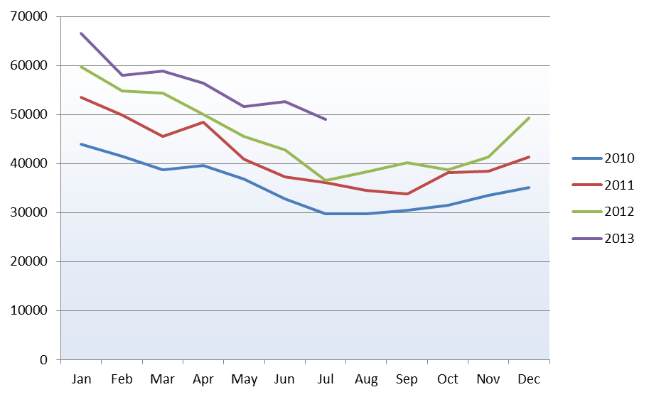
For the example marketing data I will use (purely for illustrative purposes), we are looking at web traffic with a vital seasonal component.
The seasonal element was apparent over an annual period, with high hits in January and more level volumes through the rest of the year, with a lull in the summer months. Year-on-year growth is also evident.
To break down the data, we need to find the underlying growth trend and the seasonal trend.
Step one
Firstly, we smooth out the marketing data over the year using a weighted moving average (MA). As the trend is annual, the moving average must include data points from all months of the year. This will give us the underlying growth component; from there, we can calculate the seasonal component.
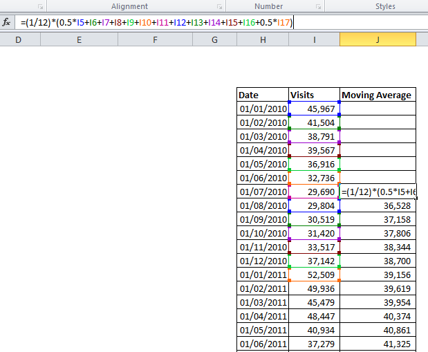
In the example, I produce an average monthly sales value by averaging over the six months on either side to produce a centered moving average of order 12. For July, January is included twice, so we halve those values and then divide by 12 to obtain a monthly figure. Necessarily, we lost some data from the start of the sample, where there were not six preceding months.
Step two
The next step requires us to choose whether a multiplicative or additive model is suitable. In a multiplicative decomposition, the seasonal element varies according to the underlying growth, whereas in an additive model, it remains consistent in size. This can usually be gauged from the graph.
The chart above shows that the seasonal differences in later years, when traffic is higher, are more significant – this suggests a multiplicative model is required.
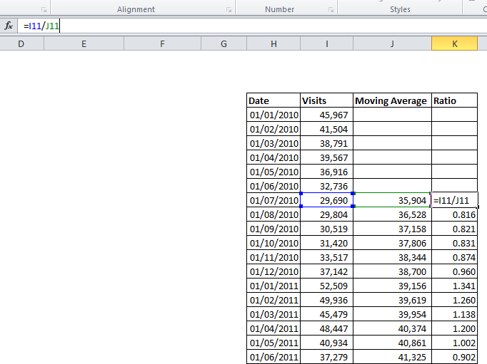
We can now calculate the ratio between the moving average and the raw figures. This is simply the raw figure divided by the corresponding MA figure (in an additive model, we would find the difference rather than the ratio).
As shown below, this gives a series of numbers on either side of one – in August, just 0.816 of the long-term traffic was observed, while in January, 1.341 times the long-term average was recorded – as we would expect, having seen on the initial graph how the seasonal fluctuation affects this data.
Step three
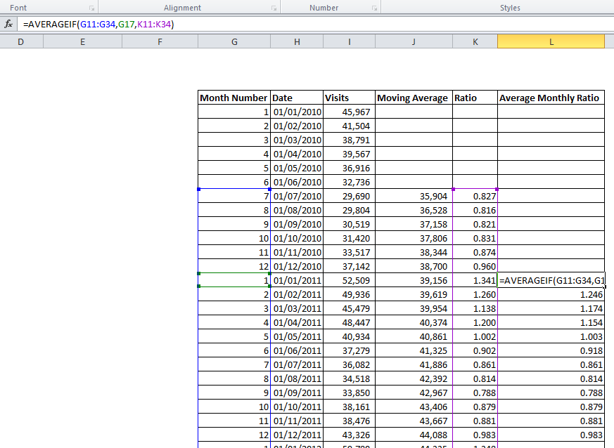
Above, we only see values for July 2010 through June 2011 – in the actual analysis, we would use the whole available dataset, giving multiple values for each month. We should then average these (e.g., the January figures together, the February, etc.) to obtain more reliable seasonal coefficients and smooth out some of the noise in the data.
As we are working with ratios, the difference in the absolute values between October 2008 and October 2012 does not affect the calculation. This can be done using Excel’s “AVERAGEIF” function:
We now have a separate ratio for each month of the year. These should now be scaled to ensure their average is one (depending on the dataset used, it may not be). To do this, divide each monthly figure by the average of all 12. This ensures we are not inflating or deflating the raw figures when adjusting for seasonality – the 12 values must sum to 12, thus averaging one.
Step four
Let’s now look at the underlying growth trend – we need to find the average monthly increase in traffic to supplement our marketing data. Using the Moving Average data we have created, plot a chart and add a trend line.
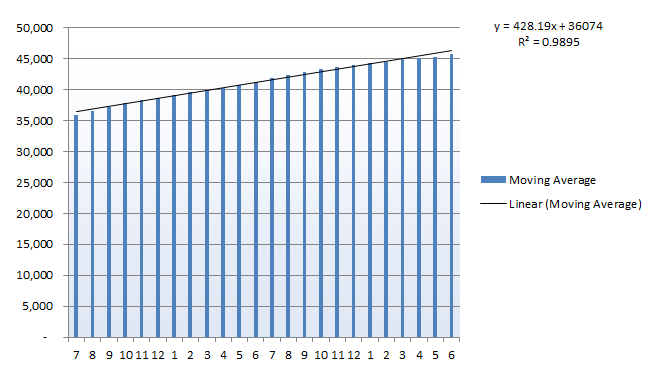
Here, the linear trend-line provides a very close fit, with an R2 value close to one. The equation on the chart tells us that, starting at a base of 36,074, this data has subsequently seen an average growth of 428 visits per month over the assessed period. Other datasets may show a quadratic, exponential, or more complex growth trend.
The analysis we have done would enable us to measure long-term growth and also explain the seasonal variation in quantitative terms. In some industries, seasonal fluctuations may be easily explained – consider ice cream manufacturers or producers of Christmas decorations. Sometimes, the seasonal element may be more subtle, though – and remember, seasonal trends aren’t restricted to Spring/ Summer/ Autumn/ Winter – differences in site traffic over an individual day may also benefit from this analysis.
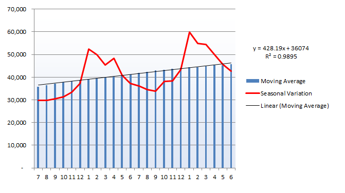
The seasonal variation line above plots the raw data for each month, showing how we have smoothed out the peaks and troughs over the twelve-month cycle to arrive at a long-term average.
We can also use this average growth figure to predict future growth and adjust every month using our determined seasonal parameters.
Step five
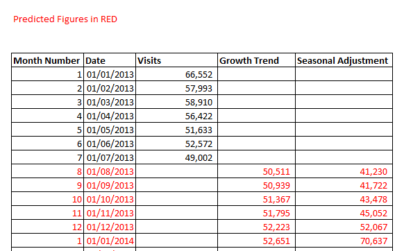
We can now quickly produce a straightforward and approximate forecast for future months’ performance.
For each subsequent month, add the 428 visits we have determined to be the underlying growth rate and multiply by the appropriate monthly coefficient.
For the first month to be predicted, I have used the average of the 12 previous months as a baseline value. The Growth Trend column then adds 428 visits each month, and the Seasonal Adjustment multiplies this figure by the monthly coefficient we have calculated.
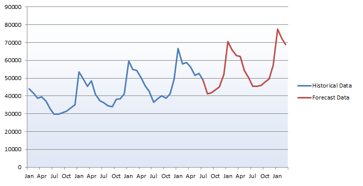
Here, we see the forecast figures against the historical data we used. It appears we have preserved the overall trend while paying particular attention to the seasonal spikes and troughs through the year.
This method can give us an approximation of the signal for future months. It should be remembered, though, that each forecast month is based on the previous prediction, so this trend could go awry if hitherto unconsidered factors become involved. More advanced analysis could produce a 95% confidence interval for each forecast and would typically use exponential smoothing or another method more powerful than time series decomposition.
To sum up…
Time series data can sometimes display apparent trends, as in the final graph above. While a pattern of growth and a relatively regular seasonal pattern are visible, it may be hard to explain this data as an overall trend.
Breaking down the series into different components may allow easy modeling of each part; in this example, we have arrived at the overall growth rate and seasonal coefficients for each month’s impact on this. Going further, we may attempt to uncover any cyclical trends, such as the longer-term economic cycle, or use more sophisticated methods to allow more accurate forecasting to be carried out.