Our narrow mobile screens demand the most concise content yet, so how should you be adapting your copy?
Why mobile matters
According to Buzzfeed’s summary of industry trends, millennials are spending over five hours of every day on a smartphone. “Mobile has taken the lead as the primary platform for social and sharing” the viral content site published – and usage continues to rise. In reaction to this the site now creates mobile-first content and urges content marketers to remember that “those who act sooner will have the advantage”.
Likewise, Google now favourably lists websites that it considers mobile-friendly within its mobile search results. “We see these labels as a first step in helping mobile users to have a better mobile web experience” a spokesperson affirmed. This should not be to the detriment of us marketers however, as Google is commendably thinking of user experience first. Consumers are unlikely to be satisfied with poor phone experiences (I know my own patience does not await a buffering circle icon and my thumbs won’t stand for endless scrolling), but what does “mobile-friendly” mean for writers?
Five steps to mobile-friendly writing
Our design manager Michael Hope will be my new worst enemy, but I can back this up with Andy Parker’s presentation from the Content Marketing Show 2014: yes, design matters, but it matters as a communicator of content. It helps to convey your message, to make navigation through your content flow easily. Design, without great copy, is worthless. Andy, a design buff himself, says we get stuck focussing on visual design until it looks pixel perfect, then we hope the copy fairies will wave their wands and BAM site done. Ideally, these layers should work together. So, let’s look at how to get the most out of language.
Avoid distraction
Think of how quickly you dart between apps and scroll through articles, eyes-squinted, until something stands out. This is the type of reader you need to imagine when writing. You can’t win them over with a great headline; every single word needs to be there for a reason.
Think of user intention
Not only will your reader be distracted by their own fleeting mind, they will also want every task they are fulfilling on their phone to be completed in no time at all. Mobile users will often be on-the-go, making short, purpose-led copy crucial. In short, your content needs to give the right answers and quickly.

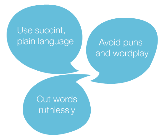
Use the right words
If you are writing for a mobile site, your use of language should reflect this. Check that your use of vocabulary is suitable for the device that they will be using. Note: If your content will still be accessed via your desktop site, you needn’t follow this point.

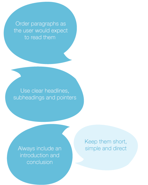
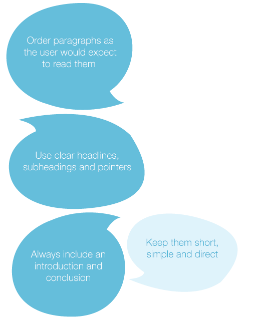
Structure logically
A phone user’s experience of content is unique in that they must remain compelled to scroll from the headline downwards in order to continue reading. This makes it important that your structure optimises the ease of this process.
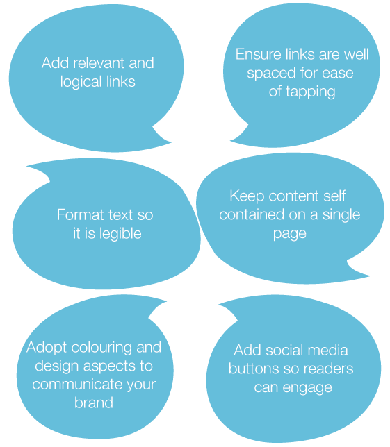
 Polish it
In order to make your content designed and optimised for mobile use, follow these polishing tips:
Traditionally, media outlets pushed content for mass appeal, but mobile sites can now pin audiences by time, location, device, and purchasing intentions. If well-planned and executed, mobile-friendly content is too fruitful an opportunity to disregard.

 Insights