We spend a lot of our time optimising our clients’ websites to ensure that they convert as much of their traffic as possible. So, we asked our Conversion Rate Optimisation (CRO) Manager, Daniel Jones, to take an unbiased look at the websites of two main parties in the 2017 UK elections from a CRO perspective.
This blog post analyses the CRO performance of the Conservative and Labour parties’ websites from the following perspectives:
- Splash pages
- Homepages
- Donation funnels
This review is based on a heuristic analysis of each website and our experience of what does, and doesn’t, work well.
We had no access to website performance data, nor have we ever worked for either Party.
Is CRO important during elections?
In 2016, Kyle Rush, former Head of Optimization at Optimizely, revealed that his team’s CRO efforts helped Obama’s successful second presidential campaign raise a historic $1.1 billion in total funds.
Of that sum, $690 million dollars using website optimisation techniques. This demonstrates the power of conversion rate optimisation when used effectively in the political arena.
In this scenario in the US election, the goal was for visitors to donate. For the UK Labour and Conservative parties, the goals also include persuading people to join the party, sign up to a mailing list, or to access further information that will persuade them to vote.
Splash pages
‘Splash pages’ are a well-established technique to communicate key messages before visitors’ land on the main website. So how did the two parties’ splash pages compare?
Conservatives
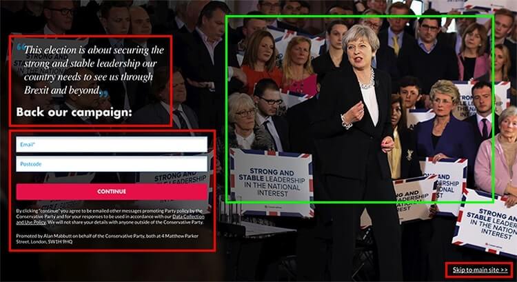
The good
- The image of Theresa May with people in the background looking towards the form sends several messages. Firstly, it uses social proof to demonstrate Theresa’s popularity, one of Robert Cialdini’s key principles of influence.
- The image also uses a directional cue to draw visitors’ attention in the direction of the form. According to studies the ‘Eye gaze cannot be ignored‘. Theresa May is looking in the direction of the form, which will influence where the visitor’s focus is on the page.
Opportunities for improvement
- The headline and the pull quote (‘This election is about…’) both lack clarity and visual hierarchy. Both compete for the visitor’s attention, because of their varying font weights and styles.
- The pull quote also lacks persuasion and does little to grab the visitor’s attention.
- The headline ‘Back our campaign’ lacks a compelling edge and urgency.
- ‘What do I get from signing up?’: this question is not addressed.
- Whilst placing the field labels inside input fields looks aesthetically better, they disappear when the visitor starts to type. If the visitor then gets distracted, or forgets what they are doing, they have to delete any incomplete entries to remind themselves of the field label, which causes frustration.
- The call to action button ‘Continue’ is not a compelling message to direct visitors to the next stage in the process.
- The ‘skip to main site’ link, while visually separate in both proximity and style, could easily be missed by a visitor simply wanting to browse the main website.
Labour
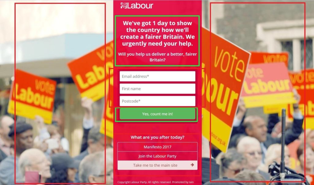
The good
- The page leads with an urgency-driven headline and is followed by an appealing question, which will speak to directly to Labour’s target audience. This copy is clear and compelling.
- The copy below the form, ‘What are you after today?’, tries to fast track visitors to different areas of the website. This gives the text on the page a good balance, aimed at specific persona types.
- The primary call to action button, includes a persuasive ‘Yes, count me in!’ message, which is an emotion-driven statement.
Opportunities for improvement
- As with the Conservative’s splash page, the field labels are inside the input fields, which can cause frustration for visitors.
- The ghost call to action (i.e. where the button is transparent) called ‘Join The Labour Party’ is not immediately recognisable as a button.
- Again there was no clarity around the value of signing up.
- The background image has a rather generic and impersonal sentiment to it, which contrasts to the image choice on the Conservative splash page.
Homepage
Conservative
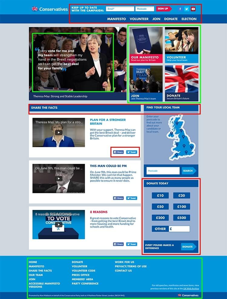
The good
- At a glance, the first section of the site provides clear pathways for different persona types to take, effectively speaking directly to the five most likely website visitors.
- The information architecture is consistent, and content is easily accessible.
- A simplified footer makes it easy for visitors to access further information.
Opportunities for improvement
- The main navigation has become confused with calls to action i.e. persuading visitors to sign up to the campaign. This will affect how easy it is for visitors to learn and remember how to interact with the site.
- The design of the news blocks (e.g. ‘Theresa May my plan…’) makes them appear isolated from the section title (‘Share the facts’), whereas ‘Find Your Local Team’ and ‘Donate today’ are clear and well-connected.
- The ‘Share’ and ‘Tweet’ buttons are poorly positioned.
- The donation elements on this page offer little in the form of persuasion to convince visitors of the benefit of donating and are positioned in a low priority area on the page.
- Overall, the design looks flat and the buttons lack consistency, which makes the visitor experience more difficult.
Labour
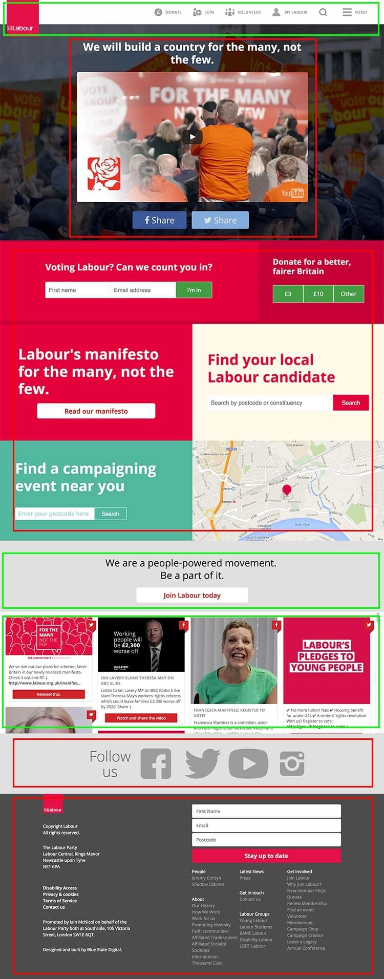
The good
- The primary navigation and branding are clear and easy to use.
- The ‘hamburger icon’ (‘≡’) together with the word ‘Menu’ to the right has been proven to increase conversions.
- ‘Joining the people powered movement’ is persuasive.
- The homepage is kept fresh with a continual feed of posts from social media.
- There is a compelling, easily accessible donation subsection headline towards the top of the page of the site.
Opportunities for improvement
- The primary donate option appears below the fold for visitors on 1024 x 768 screens.
- The content below the main section suffers from a lack of visual hierarchy.
- There are four different button styles: inconsistent styling is confusing and leads to lower conversion rates.
- One of the buttons is a ‘ghost’ call to action: visitor tests have shown that visitors miss these types of calls to action.
- As the visitor scrolls further down the page, visual hierarchy becomes a problem again, with oversized social media icons.
Donation funnels
Conservatives: step one
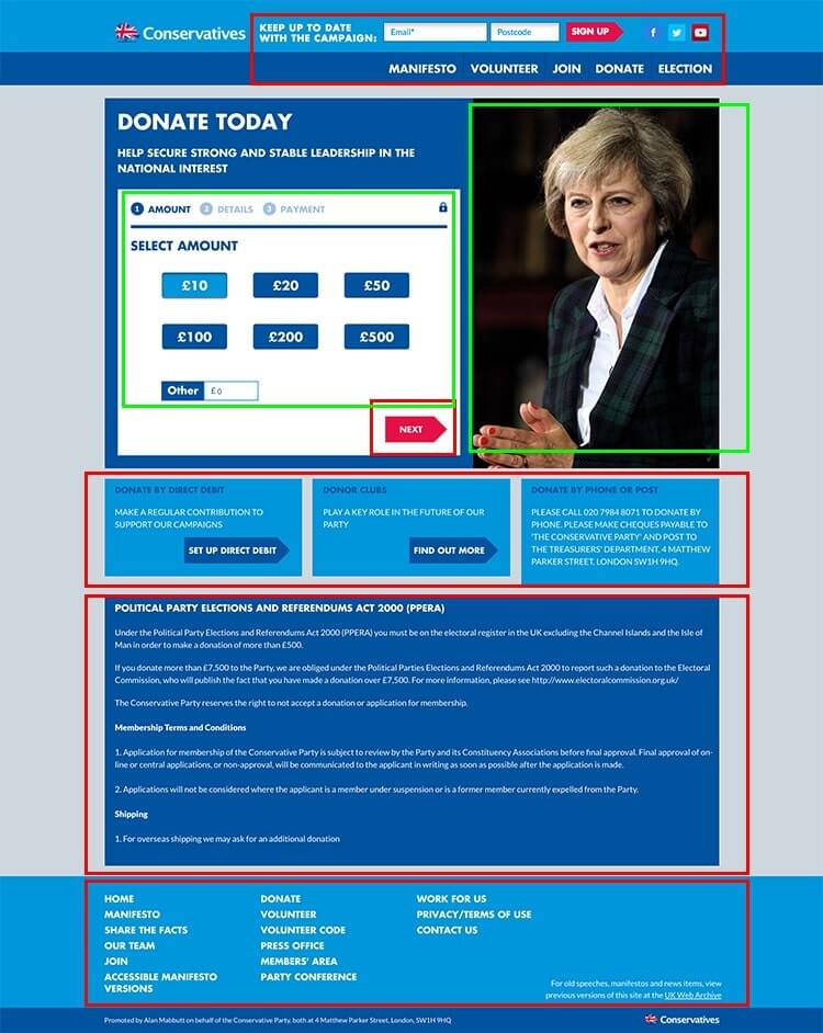
The good
- The progress bar provides valuable feedback to the visitor.
- Including the donation options as selectable buttons make it easier for visitors to select an amount.
- The photo of Theresa May pointing at the ‘next’ button and looking at the form, acts as a visual cue driving visitor attention to the form.
Opportunities for improvement
- This page has a very high ‘attention ratio’ of 27:1 i.e. there are 27 other links competing with the main call to action on the page. This will result in a lower conversion rate. Removing the header and footer navigation will address this.
- The Terms and Conditions are given high visual priority which will distract visitors.
- Giving multiple options for ways to donate (e.g. ‘Donate By Direct Debit’) is a distraction that will reduce conversions for the primary call to action.
- The ‘Next’ button needs a more emotionally persuasive label.
Conservatives: step two
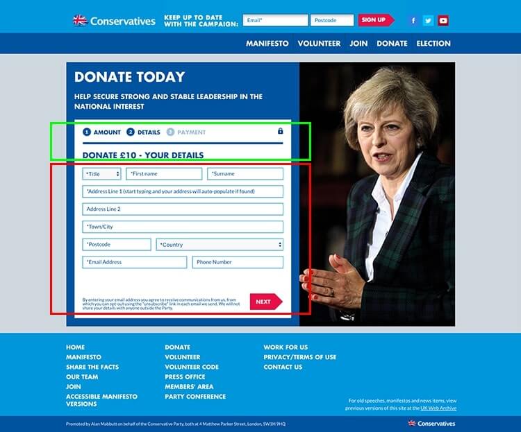
The good
- Including the lock icon confirms to the visitor that the process is secure.
Opportunities for improvement
- The form fields layout is very muddled and will lead to missed fields.
- The labels are inside the fields, which can cause frustration.
- The main call to action, ‘Next’ lacks any emotional persuasion, isn’t benefit driven and provides no feedback to the visitor about the next step.
Conservatives: step three
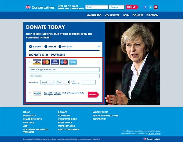
The good
- The payment icons provide recognisable and credible images.
Opportunities for improvement
- The PayPal payment method has been split from the other payment options and will cause some visitors to be confused, or miss the opportunity to make a payment all together.
- The page needs a secure payment seal: the lock icon is very compelling evidence to reassure visitors that their payment is safe.
- Lastly, the call to action, ‘Donate’ lacks persuasion.
Labour: step one
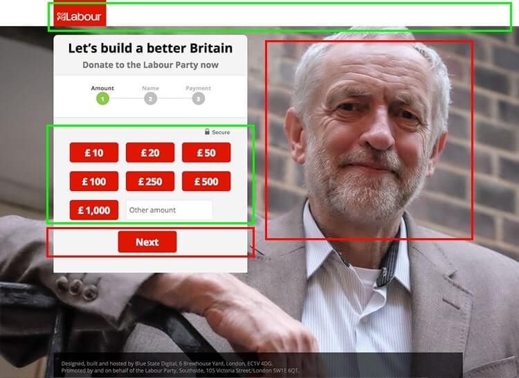
The good
- This conversion funnel has one clear goal and next step
- The attention ratio of this page is 1:1. The perfect score.
- There’s only a small amount of copy, which reduces cognitive burden on the visitor.
Opportunities for improvement
- The background photo will distract visitor attention away from completing the form.
- The call to action, ‘Next’, isn’t compelling and looks the same as the donation buttons.
Labour: step two
The good
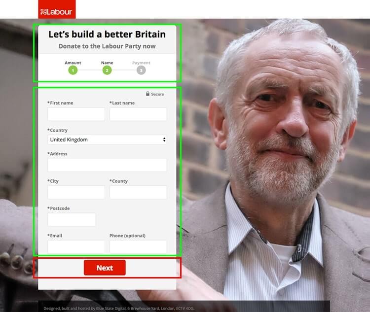
- The headline includes a compelling persuasive message, and the sub-headline makes it clear what’s happening.
- The progress bar gives the visitor feedback on their status within the journey.
- The form contains fields with labels outside of the input field itself and benefits from a clear and clean layout.
Opportunities for improvement
- More compelling copy on the call to action button (‘Next’) would encourage visitors to move forward with the process.
- Including asterisks before the field label superfluous: form checks will inform the visitor if it is required.
Labour: step three
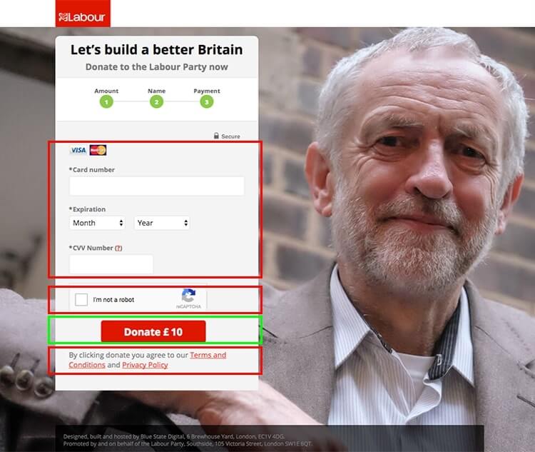
The good
- The donation button has been customised to the value of the selected amount, making it more relevant and compelling to the visitor.
Opportunities for improvement
- The inclusion of the Google Recaptcha to stop spam bots using the form is a conversion barrier. This would be better addressed by using alternatives like honeypot and baretrap.
And the winner is?
Purely from a CRO perspective, Labour has the best splash page, the Conservatives have the best home page, and Labour’s donation funnel is the better of the two.
So overall, Labour’s website is the better of the two, and is more likely to convert visitors into voters.