Following on from a post on Econsultancy about the growth of mobile, I thought I’d take a look at a more recent cross section of traffic across a number of websites in different niches.
Econsultancy said that in August 2011, 20.6% of all traffic in the UK was now mobile traffic. Since then, figures suggest that mobile device usage has seen a large surge in the first eight weeks of 2012 – up 377% year on year.
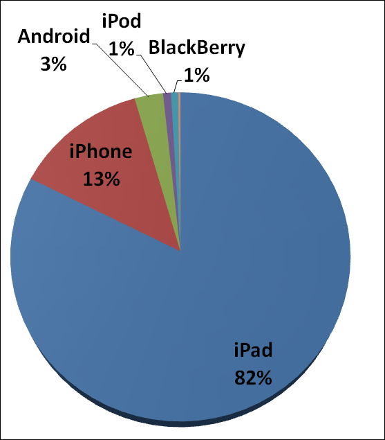
Mobile device traffic split
This is predominantly driven by the iPad which has an 82% share of this traffic.
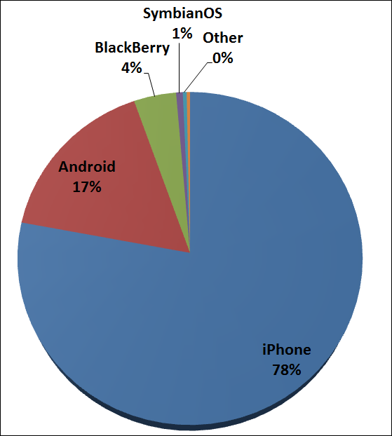
Traffic split by smart phone
The smart phone market is dominated by the iPhone:
So far in 2012, visits from smart phones are up 169% year on year.
These figures are from a small cross section of sites, so it would be useful to see if other people are seeing similar patterns.
Is my site optimised for mobile users?
You may have a site that renders well in a smart phone or on an iPad, but we need to think about the context and intent behind search queries performed on these devices. It’s extremely important to cater to the differing needs of a mobile user. For example, would a user be looking to buy a washing machine from their smart phone, or are they more likely to be performing a search on the fly, to compare prices whilst stood next to a washing machine in Comet for example?
You can never assume that a mobile device user would be doing either of the above, but it is definitely worth embracing the fact that more increasingly visitors to your website are not always going to be desktop users. Users of mobile devices can have different behaviours and needs than those typical traits performed whilst in a desktop setting.
Is the conversion the right one for mobile?
For the washing machine example it would be worth testing different calls to action that would potentially appeal to a smart phone user – for example, a prominent ’email me this product button’. This would allow the user to send a link to their desktop and captures the lead for you.
This example is extremely helpful in understanding and measuring the impact and profitability of your different marketing channels. There are many ways that we can lose insight into how users interact with the site. They can clear cookies, use different browsers or PC’s at home / work and use their mobile devices.
Being savvy and understanding exactly what mobile users wants from your site (and then giving them what they want on your website) will improve conversions and help you attribute income to different channels.
Summary
Every year we are told ‘this year is the year of the mobile’, and up until now we’ve not seen the explosion everyone keeps talking about. The technology is there now, however too few sites are actually catering to the mobile user experience. I can’t help but feel that there are many large companies missing a trick here; either by not having a mobile site, or just because they are not optimising their mobile site well enough.
I would say mobile is extremely important right now; Econsultancy recommended the following:
“If 20% of your traffic is mobile then you should get a mobile site”
I would say look at the analytics and do the maths. You may be getting significantly less than 20% of your traffic from mobile devices but what are you missing out on – would you have more mobile traffic if you had a mobile site and would those users be more likely to buy from you?
Below is an example of what metrics you could look at in order to justify a mobile site build to your boss:
If a mobile site (costing £10k) was built and increased the conversion rate to just 0.8% (an increase which is more than attainable), then the increased profits would pay for the site in just 5 months.
This would allow you to test and learn more about your mobile traffic so you can give mobile users exactly what they want. This will allow you to stay ahead of the competition and put infrastructure in place to cope with the needs of this ever-growing market. By 2013 mobile internet usage is set to surpass the PC according to Gartner 2010.
Not having a mobile site could be impacting the effectiveness of your other marketing campaigns, for example your relevant traffic from your SEO and PPC campaigns.
Top tips for mobile sites
- Treat tablets, desktops and smart phones differently – analyse and optimise for each accordingly
- There are many ways in which you could create a mobile site, be it on a subdomain, subfolder or mobile domain (.mobi). There is also the option of using responsive web design which detects the device and uses different style sheets to display content specific to that device. Responsive web design seems to be in favour at the moment because it’s much easier to manage and administrate
- Click to call – make sure it’s prominent and big enough for a thumb to click. You can also track it as a goal using a virtual page view. 65% of mobile users call a company after searching (Google, “The Mobile Movement: Understanding Smartphone Users” 2011)
- Understand how users of tablets / smart phones are interacting with your site using analytics –
- Look at the bounce rate compared with desktop users
- What pages are they landing on / what search terms are they using to find the site? This may give an indication as to behaviours of search users from smart phones e.g. is there more product search opposed to generic, which could possibly indicate price comparison searches whilst in-store?
- Make it fast – Think about load times over a 3G network


