In content marketing and online PR the importance of great content has been firmly established; if your copy doesn’t cut it, no one will want to read it. If no one wants to read your content then it has no value. It’s no secret however that people have a considerably shorter attention span online than elsewhere. Therefore, just great words alone are likely to equal a TL;DR; no matter how insightful or informative your content.
Using images to break up text and make content more visually appealing and readable is vital online. Adding photos into your content not only illustrates the topic, making it more enjoyable for an audience, but it can allow content and online PRs to add value to their work by offering something extra. Creating your own photography to accompany your content is ideal for many reasons. Firstly, it avoids copyright issues since it is your own work. Also, it will be unique, tailored for your content and can be produced in-line with a brands image.
Whether you are offering photos as an exclusive to a third-party site, or hosting them on a company blog, it is worth spending the time to create high quality photos. With photo-heavy social media platforms such as Pinterest, attractive images will increase the chances of your content being read and shared. A high-end camera isn’t necessary for creating high quality photos but attention to detail and conscious composition certainly are. Here are some simple tips for improving your photos.
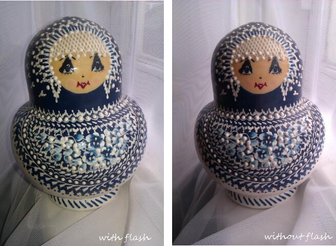
Tips for taking photos: Using the flash
Whilst the flash can be helpful for some low-light situations, it is often better to find time to shoot in natural light. However, a common mistake is to use the flash even when there is adequate light. These images were taken using a smartphone – notice the unsightly shine on the first image due to the flash.
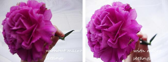
Using the macro function
If you are taking a close-up photo, even when using a basic digital camera it is possible to achieve a shallow depth of field creating a more professional-looking photo. Using the macro setting (that’s the one with the flower icon) and pressing the shutter button halfway to focus before taking the photo will allow the camera to adjust correctly. These images were taken on a point and shoot camera where the macro function has allowed the detail in the foreground of the flower to stand out.
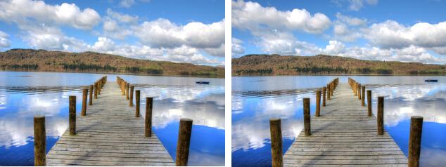
Straight horizons and good composition
The golden rule above all else when it comes to landscape photography is straight horizons. If you find this a bit tricky to gauge, most cameras should have a grid function which makes levelling the photo much easier. Some smartphones also have the option of downloading an app to do this too. These are HDR images taken with a DSLR but the tilted horizon instantly makes the photo look amateurish.
Tips for editing photos
Free software such as Gimp is an essential part of any content and online PRs toolkit. Gimp offers a lot so can be a little daunting when first getting started but, with a little experimentation, it is very versatile.
A great way to edit your photos on Gimp is using the Curves tool found under the Colours menu. As well as improving a photo, curves can totally alter the tone and mood of an image. Before beginning, consider how you want the photos to look: what kind of image does the brand have? If the images are to be hosted on a third-party site, what kind of image does this site have?
Dont fear – curves look scary but they are surprisingly intuitive. Each image is different so it is important to experiment and see what works for each individual photo; just remember its better to err on the right side of understatement. Below is how you can easily produce a more vibrant image and how to add a vintage feel.
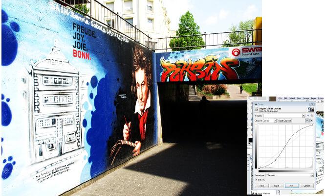
Here is the original image:
The S curve
Opening the curves dialogue and dragging the line slightly up and slightly down to create an S shape will increase saturation and contrast creating a vibrant, colour-rich image.
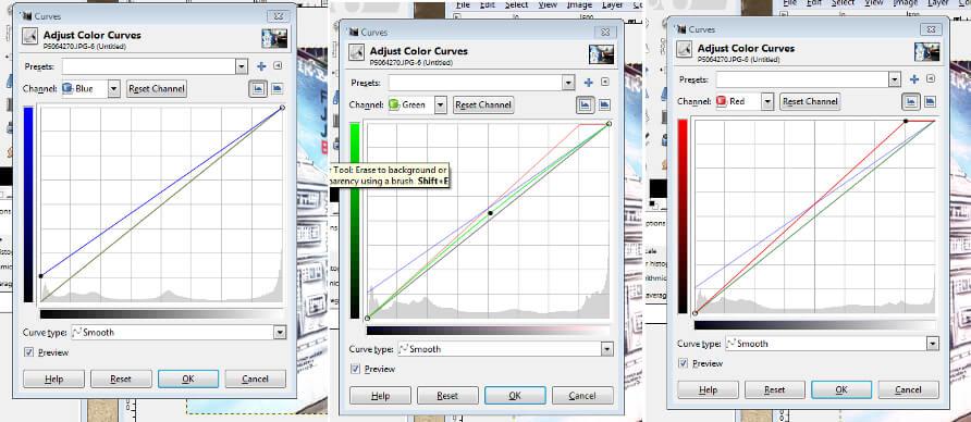
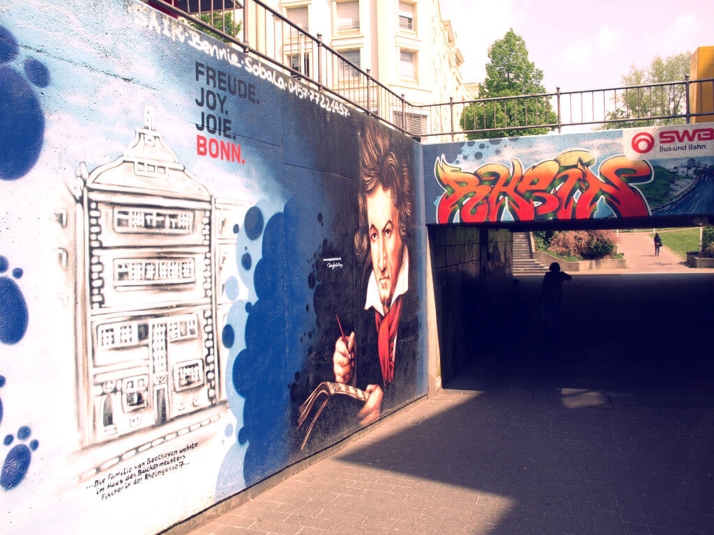
A vintage look
A slightly more complicated job, this requires altering the three colour channels within the curves feature. Once again the amount for each will depend on the individual photo but below is a rough guide to how they should look and the resulting image:
Using these simple tips and tricks, combined with proper image optimisation, it is easy to create better images worthy of accompanying well-researched and high quality written content.
All images: Natalie Clince